Bridging brand storytelling, user psychology, and business needs into one cohesive digital experience
End-to end UX design / Desktop & Mobile / 75 hours / March 2025

THE BRAND

KimlyParc is a Korean instant coffee brand launched in 2023 in the U.S market. As customers quickly recognized its quality, the brand earned recognition as Amazon’s overall pick.
THE BUSINESS PROBLEM
Great coffee, weak website
The missing pieces
Winning
U.S. Shoppers
Despite strong products and credibility on Amazon, KimlyParc’s own website wasn’t converting. It lacked a compelling brand story, persuasive product pages, and the trust-building experience shoppers expect when buying directly from a brand.
A landing page with a clear hook
A brand story that felt unique
Product pages explaining benefits quickly
Marketing assets like a newsletter template
Beyond just design, the site needed to feel familiar to U.S. shoppers - intuitive, trustworthy, and aligned with Ecommerce standards - to actually convert visitors into customers. Since KimlyParc is a Korean brand produced in Korea, and Korean ecommerce patterns differ from U.S. norms, it was essential to adapt the experience for U.S. expectations.
How might we redesign KimlyParc’s website to capture attention, clearly tell the brand’s story, and guide U.S. customers through an engaging, market-standard shopping journey that drives sales?
-
Uncovered U.S. market best practices, defined KimlyParc’s unique strengths, and synthesized user insights on instant coffee, storytelling, and cultural heritage.
-
Defined user goals from research and crafted product storytelling through content strategy, information architecture, layouts, visuals, and infographics - ensuring the brand story was clear, engaging, and easy for users to follow.
-
Developed lo-fi to hi-fi wireframes, conducted usability testing, and iterated designs to ensure storytelling and purchase flows were intuitive, persuasive, and user-centered.
-
Built the final design in Shopify and launched a cohesive end-to-end experience that seamlessly connected brand story with the shopping journey.
SOLUTION
From a static storefront to a conversion-driven storytelling hub
I redesigned KimlyParc’s website as a storytelling hub that blends premium coffee, cultural roots, and a clean, intuitive shopping experience.
The new landing and an about pages highlight the brand’s strengths and Korean originality, while product pages use clear benefits, infographics to build trust and guide purchases. To keep the story consistent beyond the site, I also designed a branded email newsletter template - boosting clarity, credibility, and conversion.
Explore
Before & After
BEFORE
AFTER
Email newsletter
template design
The layout reflects the website’s visual language, with clearly organized sections for promotions, product highlights, and updates.

Process
BRAND POSITIONING
Research & Analysis
BRAND STORYTELLING
Define
USABILITY
IMPLEMENTATION
Launch
Design & Iteration
BRAND POSITIONING
Research objectives
What best practices and gaps emerge from competitor products and websites?
What user pain points, motivations, and expectations appear in the survey data?
COMPETITIVE ANALYSIS
What the competition gets right - and misses
The instant coffee market is crowded, but differentiated.
BLUE BOTTLE COFFEE
SWIFT
Specialty coffee
CHAMBERLAIN COFFEE
Vegan latte
and fun drinks
Each leans on either convenience, craftsmanship, or cultural storytelling - but rarely all three.

Premium instant products made with specialty coffee beans and freeze-drying methods.

Where KimlyParc stands out
KimyParc blends the strengths of these players while offering something unique:
A vegan latte in a single packet with plant-based cream.
➕
CAFELY
Heritage-inspired

A heritage experience rooted in Korean coffee culture.
A premium decaf option that matches the quality of its espresso.
USER SURVEY ANALYSIS
133 users answered
74%
📱
discover products via social media
81%
I want to know more about coffee.
👱🏼♀️
48%
I want detailed information about the origin of coffee beans.
👩🏻
care about healthy food options
I want to access to coffee recipes and brewing techniques.
👩🏾🦱

🥗

➕
🛍️
support independent small business
70%
🇰🇷
have interests in Korean culture
Users said
What users care about
Users are health-conscious, socially driven, and curious coffee explorers - motivated by cultural storytelling, education, and value-driven offers.
Rooted in Korean coffee culture
Highlighting Korea’s “mix coffee” heritage can build emotional trust and connection with users

BRAND STORYTELLING
What we learned became who we designed for
From research and analysis, I identified KimlyParc’s strengths in premium, heritage-inspired instant coffee and uncovered user desires for health, culture, and trust. The client further emphasized positioning the brand as health-conscious, tasty, and convenient. Bringing together these insights with market analysis and client input, I defined four user personas that capture key problems, goals, and motivations.
KimlyParc’s User Personas
Crafting the story behind browsing
I designed a digital journey where content strategy, intuitive navigation, and connected user flows build trust and turn browsing into confident buying.
Brand keywords
Users instantly understand what KimlyParc stands for
Rating
Users imagine the experience of drinking it
How-to-use
“I can do this” - lowering barriers to purchase
Emphasizes Korean originality
CONTENT STRATEGY
What users need to see before they buy
Reassures users the product’s credibility
Quote about taste
Production
Every piece of content was designed to answer user questions and remove doubts

Product keywords
Users quickly connect product features to their needs
Quote about taste
Taste credibility for instant coffee skeptics
Ingredients
Clear, transparent ingredient lists reduce skepticism
How-to-make
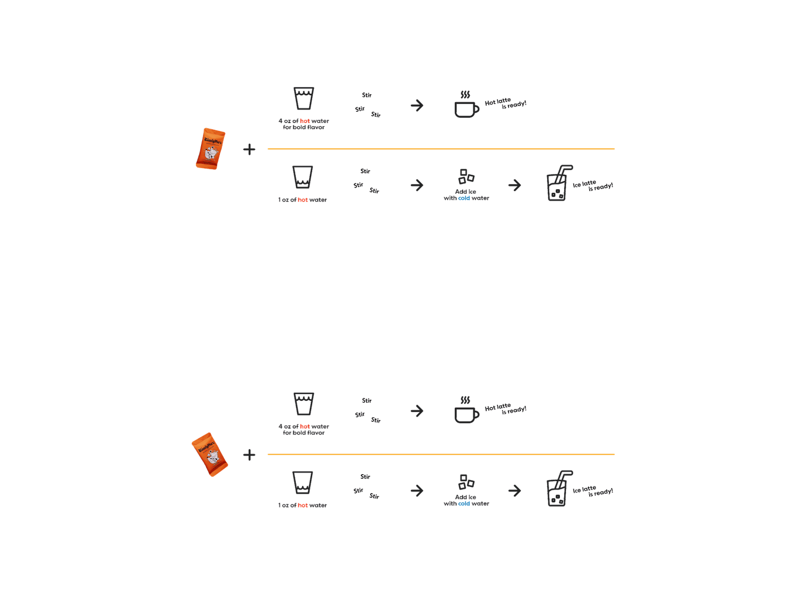
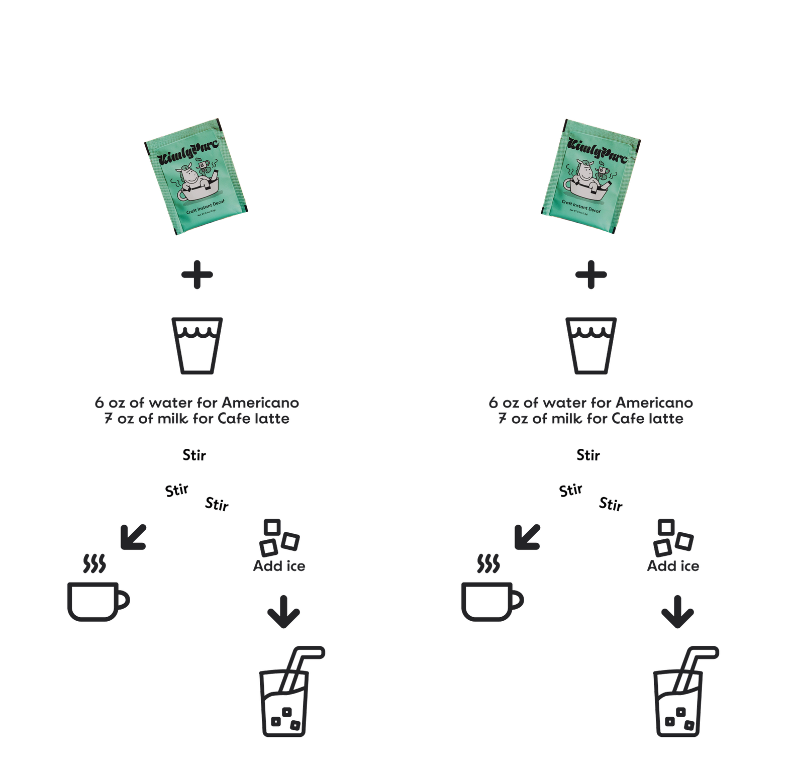
Simple steps turn an abstract product into a concrete experience
Production
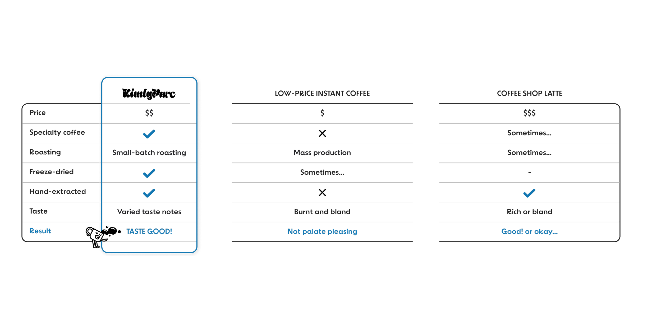
Competitive chart
Highlights craftmanship
Helps users rationalize the purchase
INFORMATION ARCHITECTURE
Make the navigation simple and intuitive to reduce confusion
BEFORE
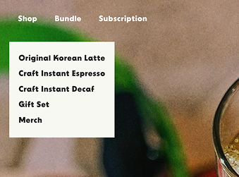
Problem: The labels mixed product types (latte, espresso, decaf) with categories (gift set, merch), making it harder for users to understand the structure at a glance.
→
AFTER
Shop All
Coffee
Bundle & Save
Gift Set & Merch
Shop
Subscription
About
Solution: Simplified categories with clear, universal labels, making the experience more intuitive and consistent with U.S. ecommerce norms.
USER FLOWS
From story to sale
I mapped user flows that transform casual browsing into clear, confident buying journeys.
USABILITY
From wireframes to a user-tested prototype
I began with lo-fi wireframes sketch to explore layout and hierarchy, then moved into hi-fi mockups and a prototype built on Shopify, the client’s platform of choice. Along the way, I created infographics to communicate product strengths, applied the brand’s visual identity for a polished, responsive design, and conducted usability testing with users - including current customers - to iterate and refine the experience across multiple versions.

LAYOUT
Sketching the first chapter of the experience
I started with low-fidelity wireframes to explore content hierarchy and layout for the landing and product pages. These early sketches provided the foundation for iteration, guided by usability goals and early feedback.
Once the structure was clear, I carefully chose photos to visually explain the content and capture attention.
HI-FIDELITY MOCKUPS
Bringing the sketches to life on screen
I turned wireframes into hi-fi mockups with infographics, responsive design for mobile users, and multiple testing and iterations to validate and refine the experience.

INFOGRAPHICS
Visuals that speak for themselves
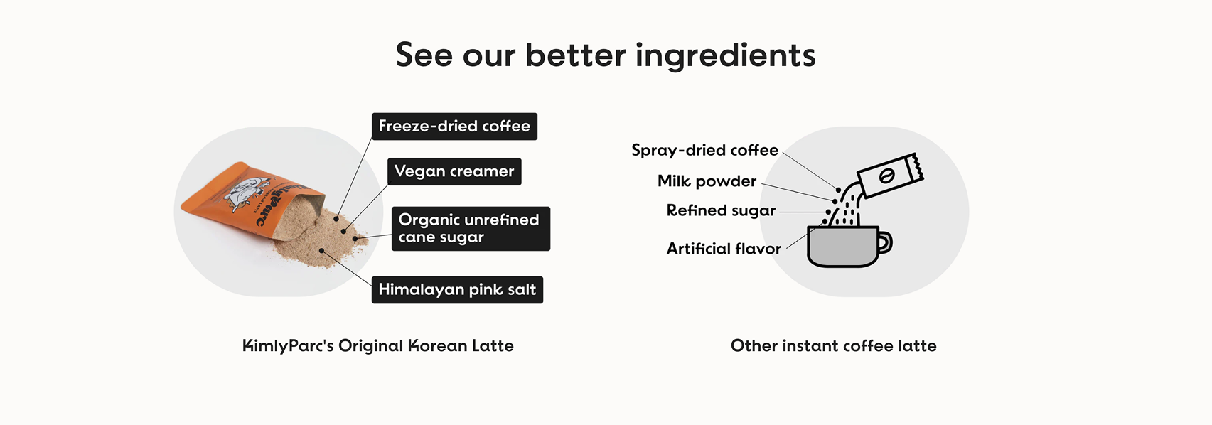
I created infographics for brew guides, ingredients, coffee bean, and competitive chart - making KimlyParc’s product strengths clear, intuitive, and easy to trust at a glance.
Click the image to view larger.
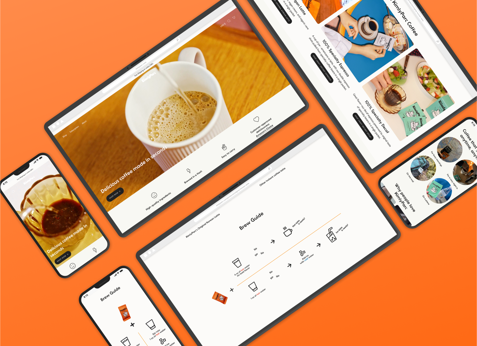
RESPONSIVE DESIGN
Designing for every screen
With most users on mobile, I created responsive layouts optimized for readability, easy navigation, and visual impact - so shopping feels seamless anywhere, anytime.
TESTING & ITERATION
Seeing through users’ eyes, improving every version
Usability testing explored how clearly users understood the brand, product details, and site usability. Insights from these tests led to multiple design iterations, improving clarity, flow, and overall experience.

Iteration Priorities
Scrolling, scrolling, scrolling…



Old Design
New Design
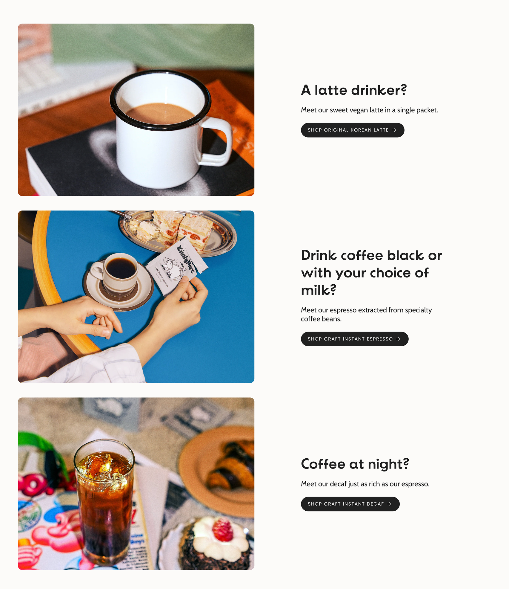
Testing revealed that users found the information long and heavy. To reduce excessive scrolling, I reworked the layout into a horizontal view - more compact, letting users see products at a glance.


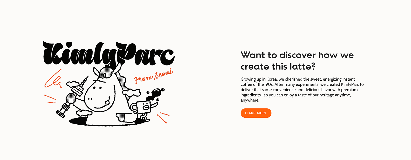
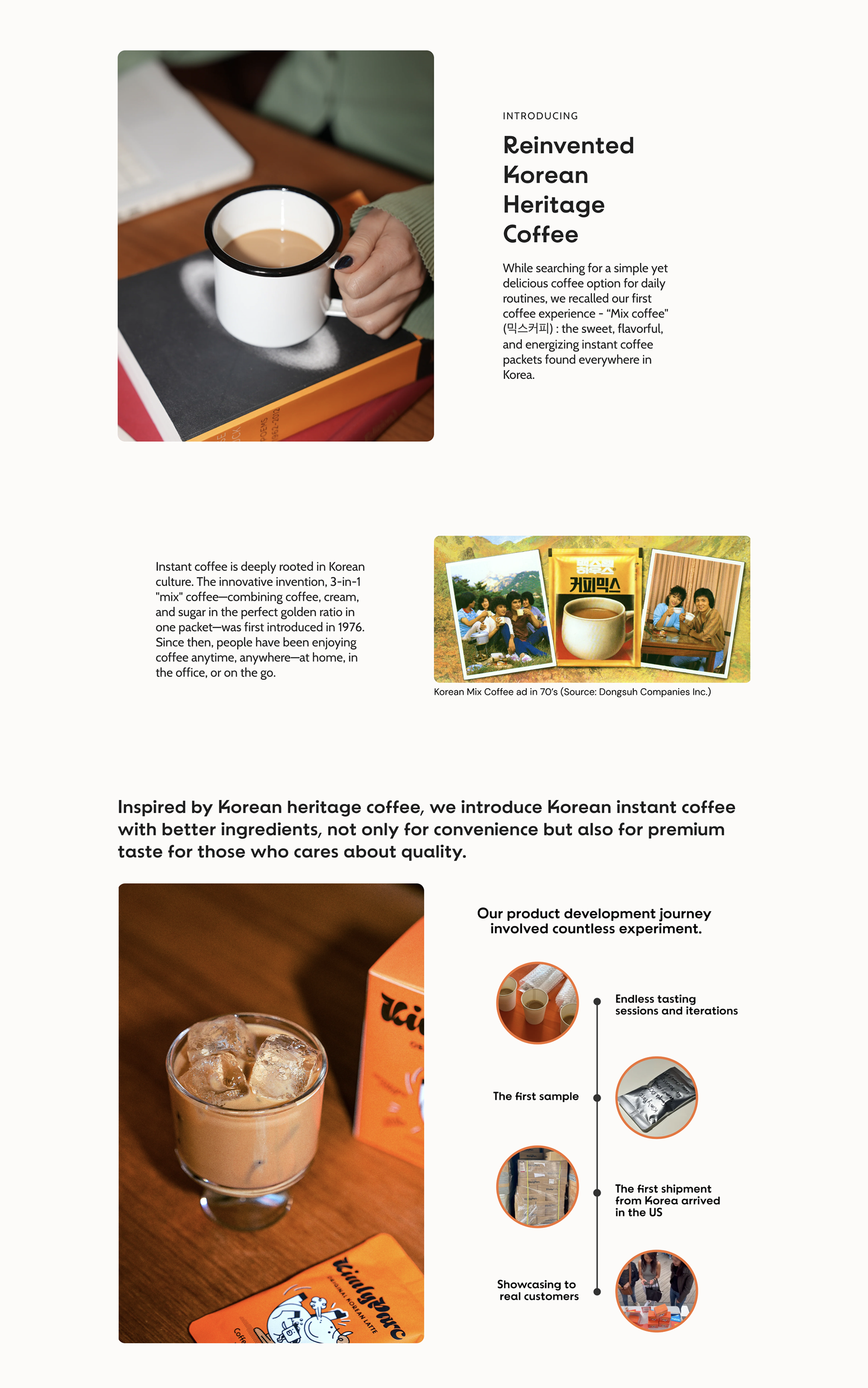
To keep product descriptions focused and consistent, I also shifted KimlyParc’s heritage story from the latte page to the About page, adding a link for those who wanted to dive deeper.
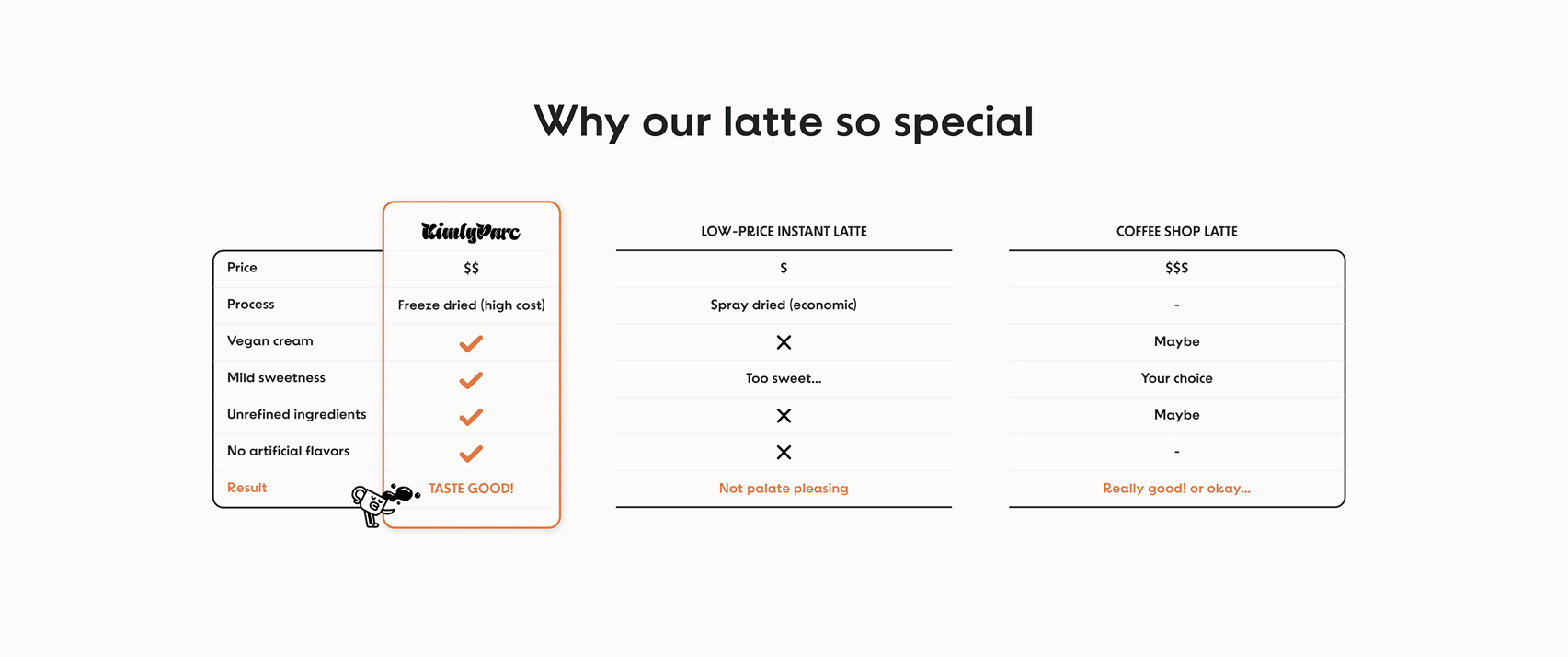
I removed the competitive chart from the latte page since the ingredient infographic already delivered the same message. By cutting redundancy, the page became cleaner and easier to navigate.
CONCLUSION
Summary
This project was more than just a website redesign—it was about communicating KimlyParc’s premium value and cultural story in a way that feels clear, engaging, and trustworthy. Through research-driven design, I created a responsive website and branded content that highlight the brand’s strengths and guide users toward confident purchasing decisions.
Design lessons learned
Designing stories people can navigate
This project taught me how to merge branding and storytelling with digestible, user-friendly content - turning complex product details into clear, engaging experience that build trust and drive action.
Takeaways from the project
Work end-to-end, from research synthesis and storytelling to responsive UI design and testing
Use UX as a strategic tool, not just for aesthetics but to drive business outcomes

Bring together research, branding, and usability to create effortless and meaningful experiences
Next Step
Track post-launch performance using analytics (e.g., conversions, bounce rate).
Expand the design system for future product lines or subscription models.
Explore personalization strategies to further enhance engagement.
