Adding a tracker feature for savings account users, enabling them to set personalized savings goals and track their progress effortlessly
UX & UI design / Mobile / 80 hours / May 2025

PROBLEM
Savings shouldn’t feel like a chore
Savings account users feel disconnected from their financial progress. They struggle to see how their money contributes to specific goals - like travel, emergency funds, or personal milestones - which makes it harder to stay motivated and confident in their planning. Current tools often require tedious manual transfers, multiple accounts, or personal notes, creating frustration and discouraging users from consistently managing their savings.
WHY SAVINGS ACCOUNT USERS?
83% of Americans have at least one savings account.
83%
35%
Resource: GOBankingRates survey
35% have two or more savings accounts. Even upwards of five accounts are held by a small percentage of people.
Americans
Also, financial experts increasingly recommend the strategy of having multiple saving accounts to help people budget, organize funds, and build financial stability.
👨💼
“
It’s essential to have at least one savings account ... Once you hit your emergency fund savings goal, you may want to open another account to save for other goals, especially if you struggle to compartmentalize your money or tend to impulsively dip into savings.
Mark Henry, Founder and CEO of Alloy Wealth Management
The trend toward having multiple savings goals is growing
However, most banking apps lack tools to clearly show how savings contribute to specific goals. Instead, users are left managing categories through tedious manual transfer or multiple accounts - a time-consuming process that creates frustration and discourages them from consistently engaging with their savings. Without visibility and ease, it’s difficult to feel connected to financial progress or stay motivated toward long-term goals.
SOLUTION
Set it effortlessly.
Watch it grow.
I designed a Savings Tracker feature that lets users set clear goals through a simple, guided flow, organize money into virtual buckets, and watch their progress grow automatically. With built-in automation for contributions, plus tracking of interest earnings and visualized savings trends, the feature transforms a static account into an engaging, intuitive, and personalized financial journey - helping users feel connected and motivated every step of the way.
01
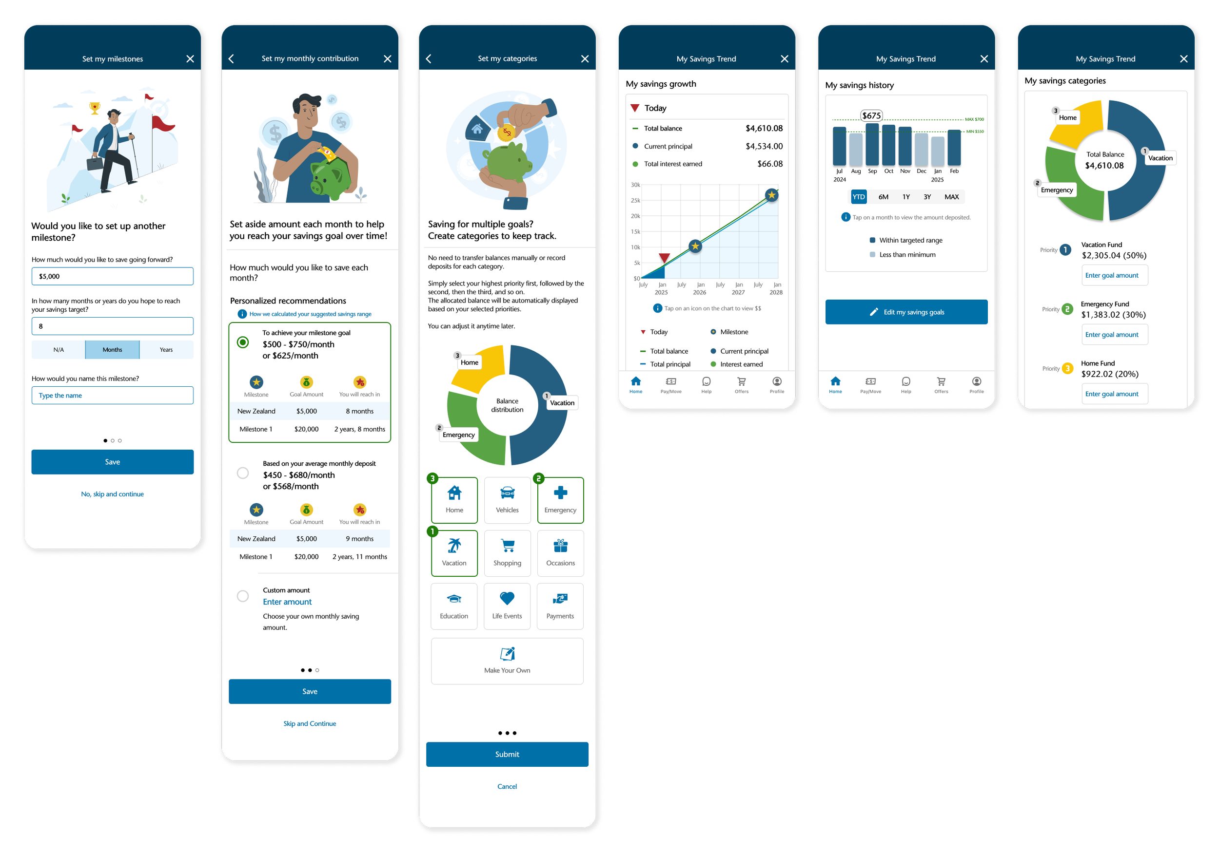
Goal-setting made effortless
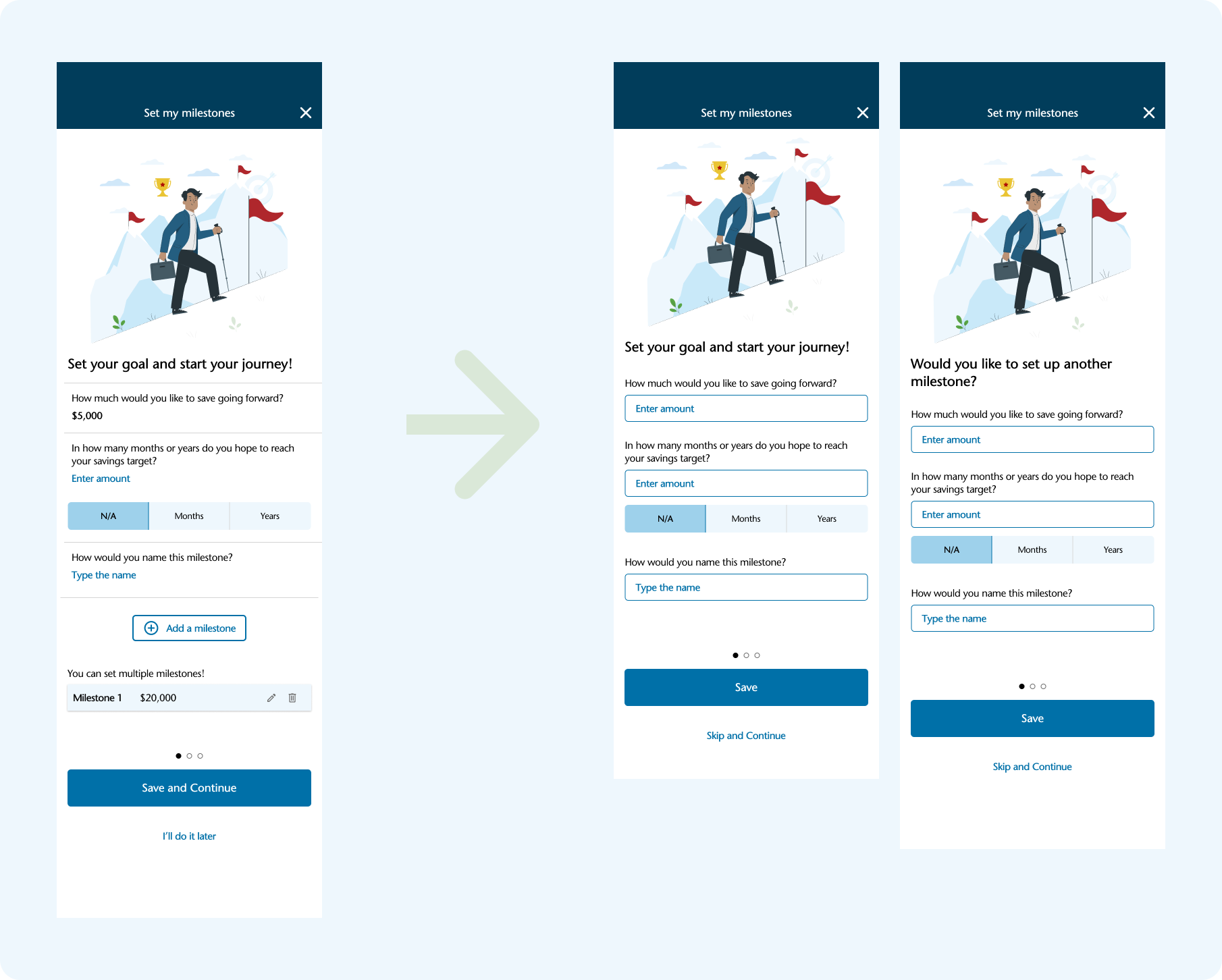
Savings shouldn’t feel complicated. I created a simple three-step flow that helps users set and organize their goals with ease.
-
Type amount, time, and name - easily create multiple goals.
-
Pick smart suggestions or enter your own - personalized guidance with flexibility.
-
Select priorities, auto-divide savings instantly - effortless organization without the math.
02
All your goals, all in one place
A clear, comprehensive dashboard makes savings goals visible. It also gives users the flexibility to edit or update goals anytime - keeping their financial plan aligned as life and priorities change.
03
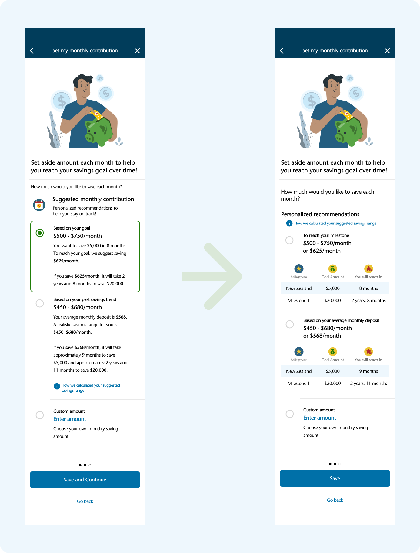
No transfers, no math - just progress
Instead of juggling multiple accounts, I designed an automatic virtual bucket system within a single account. Users simply set their priorities - like vacation, emergency, or home fund - and the system does the rest, allocating funds by weighted percentages.
04
Visualizing progress, inspiring confidence
By turning abstract numbers into clear, visual stories, users can see both their progress today and the future they’re working toward - building confidence and encouraging consistent saving.
-
See exactly how close they are to reaching each goal.
-
See how their savings could grow over time with interest amounts.
05
Track monthly deposits - no statements required
The interactive history chart visualize monthly deposits at a glance. Instead of combing through statements, users can instantly see patterns, track consistency, and spot opportunities to improve. The chart keeps users motivated and empowers more informed financial decision.
Process
RESEARCH
Competitive Analysis
1:1 User Interview
DEFINE
Persona
Project
Goals
DESIGN & TESTING
User Flow
Lo-fi
Sketch
Hi-fi
Prototype
Usability Testing
HAND OFF
RESEARCH
How do people really save?
Competitive analysis
How do existing online banking apps support savings, and where are the opportunities to design a more intuitive, motivating solution?
User interviews
How do users set, manage, and stay motivated toward their savings goals, and what barriers prevent them from organizing savings effectively?
COMPETITIVE ANALYSIS
Where banking apps fall short
Goal-setting tools
Progress tracking
Existing platforms focus on features, not experiences - leaving users without integration or meaningful feedback to stay engaged.
BANK OF AMERICA
✔️
✔️
WELLS FARGO
✔️
✔️
CHASE
✔️
✔️
CAPITAL ONE
❌
❌
❌
❌
❌
Financial projections
Interest calculations
Automated organization
❌
❌
❌
❌
❌
❌
❌
❌
❌

The gap became the opportunity
While major banks let users set savings goals via their mobile app, these tools often lack integration, automation, and meaningful visual feedback. Capital One, despite being one of the largest financial institutions, doesn’t offer savings organization tools on its mobile app beyond free multiple accounts - unlike its competitors.

🗂️
💰
📈
Organizing funds
USER INTERVIEWS
What users say
Eight regular savers gave me a closer look at their motivations and challenges:
😗
motivationI want to feel good about preparing for those big future purchases - even if they’re not defined yet.
I want my savings to grow faster with the interest from my high-yield account.
I want to organize my money better so I don’t overspend.
😮💨
PainpointsBut, when my savings just grow little by little, it’s hard to really see progress or patterns.
But checking how much interest I’ve earned takes too many steps - it’s a hassle.
But, manually allocating money or recording notes every time is frustrating.
I need to see at a glance how much I’ve earned, and how much I’ll earn going forward.
Interest tracking
I need an easier, more automated way to divide my savings into categories.
🧐
NeedsI need to quickly check my saving habits at a glance.
Future goals & fulfillment
What misses

🚫
No savings organizing tools, unlike competitors
👀
High-yield accounts lose impact with hidden interest and history
Thus, I chose the Capital One mobile app for this case study because its gaps revealed an opportunity to design a Savings Trend Tracker feature.
DEFINE
Shaping insights into action
To ground the design in user needs, I translated research into concrete definitions of who the user is, what they need, and how the product must serve them. From there, I set project goals that aligned user needs with business outcomes. Building on these goals, I mapped user flows to ensure every step of the journey laid a strong foundation for the product design.
Personas
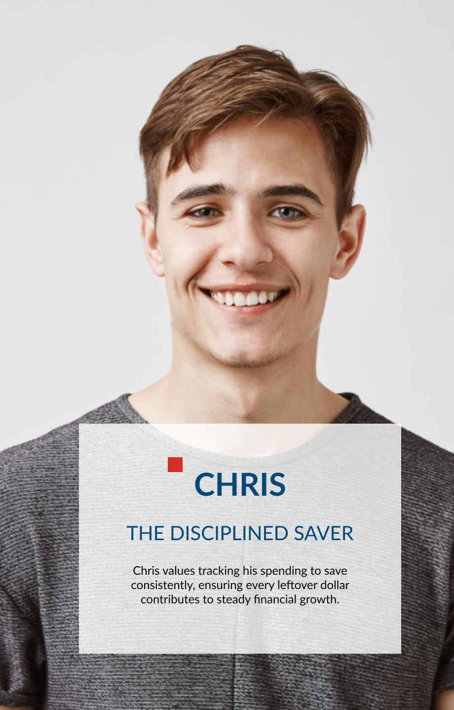
“Chris” deposits money regularly but don’t actively monitor his savings accounts. He often relies on multiple accounts or manual methods to stay organized, which can feel disjointed and time-consuming.
Project goals

By meeting user needs for clarity, motivation, and ease of use, the Savings Tracker encourages regular deposits, deeper engagement, and stronger loyalty - driving product adoption, retention, and profit growth while giving Capital One a competitive edge.
User flows
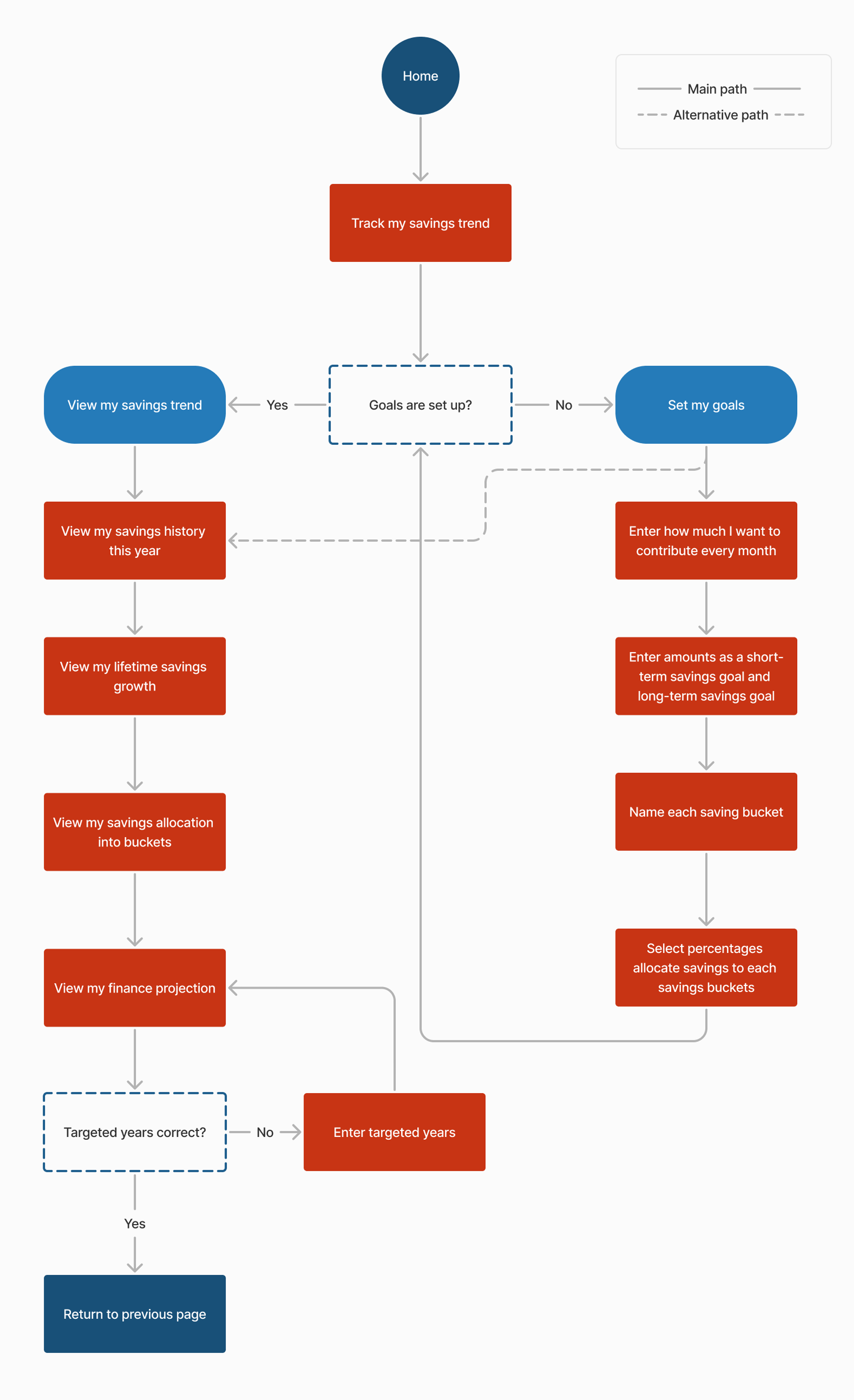
Designing the user flow for the Savings trend tracker feature to map how users set goals and view trends - ensuring a clear, intuitive experience.
DESIGN
From rough sketches to a real experience
Starting with low-fidelity wireframes reminded me how powerful early testing can be - how much clarity and confidence come from simply listening to users. As I moved into high fidelity, I focused on blending new ideas seamlessly into Capital One’s visual identity, turning early sketches into a cohesive experience that truly reflected users’ needs.
LOFI WIREFRAMES
Testing ideas before pixels
BLUEPRINT
Listening to users, redrawing the flow
Based on testing, I refined the wireframes and created user scenarios to improve clarity, navigation, and flow.
Early usability testing with lo-fi sketches showed that visual graphs motivated users to save, while feedback on “My Savings Plan” flow pointed to ways to make the experience even better with hierarchy, clarity, and navigation.
UI KIT
Blending new ideas into Capital One’s visual identity
To ensure brand consistency, I applied Capital One’s design system across high-fidelity mockups - using clean typography, intuitive layouts, and custom icons aligned with the brand’s color palette to enhance clarity, trust, and visual cohesion.
Hi-fi Prototype
From goals to growth.
All in one view.
Experience how smart visuals make saving clear, intuitive, and rewarding.
TESTING & ITERATION
-
-
Iteration Priority 1: -
Redesigned the navigation bar with clearer iconography and labels.
Old Design
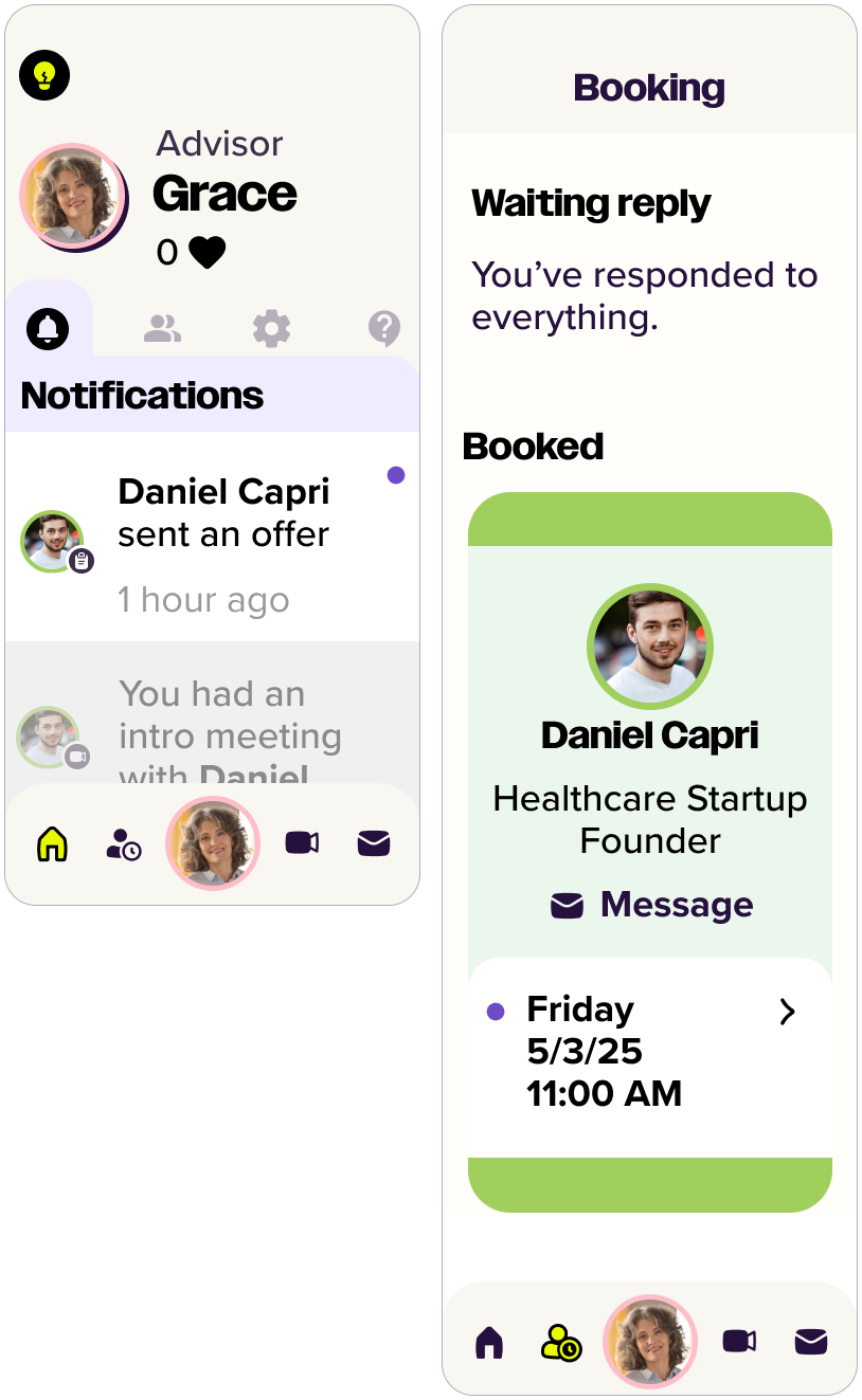
Old Design
New Design

Iteration Priority 2: Clarify messaging system
Made messaging booking flow more intuitive.
Old Design

New Design
Iteration Priority 3: Add a dedicated dashboard
Included an easily accessible dashboard on the home screen
New Design

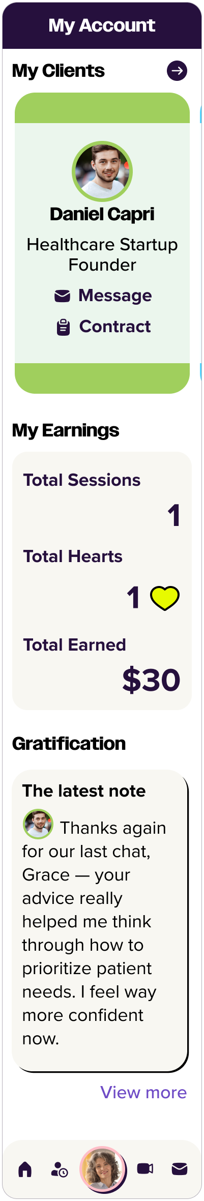
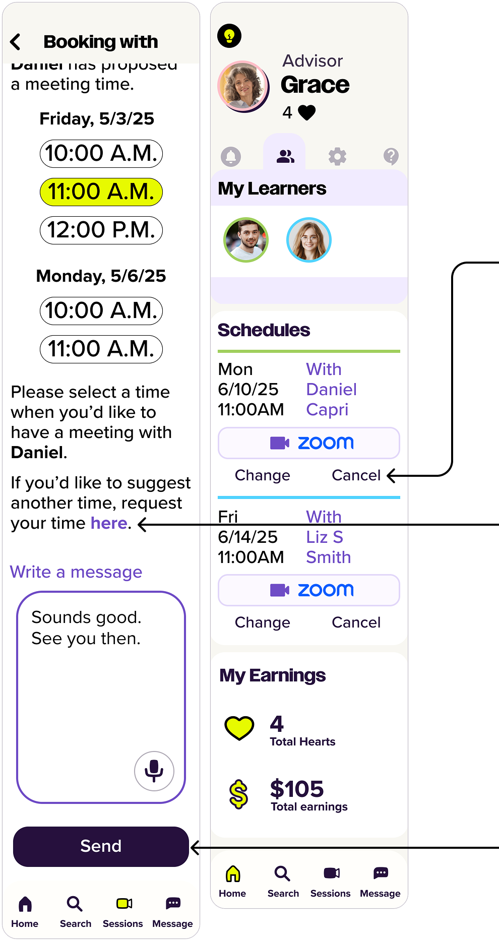
Removed the overlooked account icon from the navigation bar, allowing users to acess the ‘My Account’ page via their avatar icon on the dashboard instead.
Renamed for clear status labels, and reordered the list so upcoming sessions appear first, prioritizing the most relevant information for users.
Removed “Bookings” icon(a person with a clock) from the navigation bar and embeded the booking feature on Sessions page led from Sessions icon(video call icon).
Moved ‘Cancel the meeting’ to the Schedules section on the dashboard, making it easier for users to change or cancel upcoming sessions.
Moved ‘Propose a new time’ button to the guide and reworded it as ‘request your time here.’
Changed ‘Schedule a meeting’ to ‘send’ for users to understand that they need to send their message with time selection.
Removed the carousel, which users often overlooked, and moved the client list to the expanded dashboard menu.
Each client avatar now opens a profile card with options to view profile, view contract, book a session, and a message, view session history, view thank-you notes.
Testing & Iteration
To evaluate the intuitiveness and efficiency of the high-fidelity prototype, I conducted remote usability testing using video conferencing, screen sharing, and a think-aloud protocol. The test focused on key tasks: setting a savings goal and viewing savings trends.
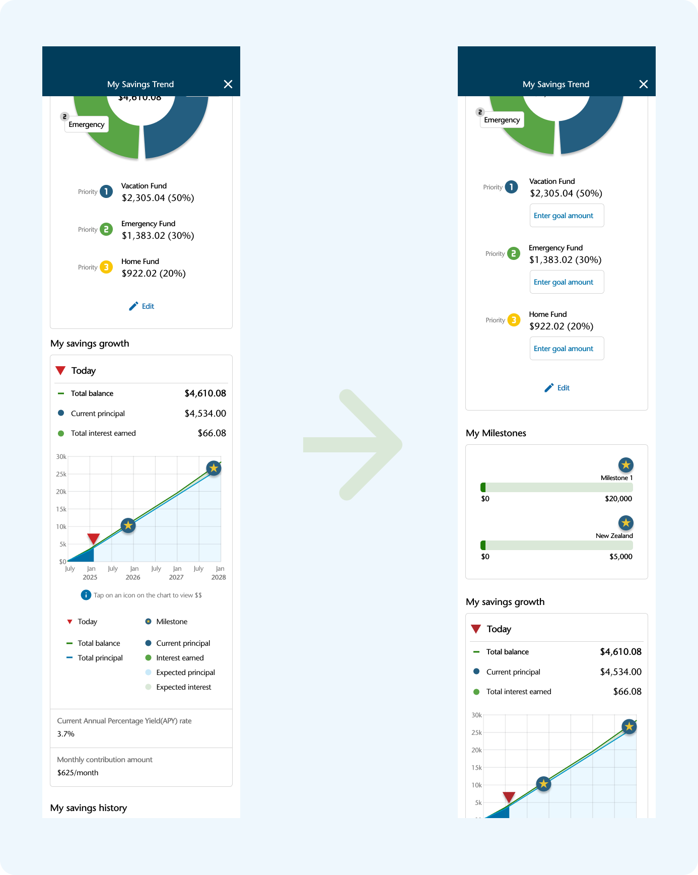
Findings revealed confusion around the multi-step milestone process, difficulty distinguishing between milestones and savings categories, and a need for clearer account linking. Users also felt overwhelmed by text and requested more visual guidance and information icons.
Conclusion
Summary
The Savings Trend Tracker helps users set savings goals, organize funds into categories, and visualize progress—all within one account. By combining automation, visual feedback, and goal tracking, it transforms saving into a more engaging and rewarding experience. The feature was closely shaped by user research and testing, resulting in a solution that feels both intuitive and impactful.
Key Takeaways
I can confidently design within existing product ecosystems, ensuring seamless integration.
I know how to conduct user research, synthesize findings, and translate them into practical design decisions.
I value simplicity and clarity—reducing friction and improving user satisfaction through thoughtful interaction and visual design.
I’m comfortable balancing user needs and business goals to create features that drive both engagement and product value.
Next Step
Exploring notification and reminder features to support habit formation
Incorporating micro-interactions to reinforce positive user behavior
Testing the high-fidelity prototype with a broader group for further validation